On-Screen Text Download PDF
The set of screenshots below is from an enrollment application project. My role as tech writer on the project was to create the on-screen text and manage the form layouts.
When creating on-screen text for applications, I aim for being concise but complete. To support the explanations, I utilize field labels along with form titles and subtitles to aid the user in understanding what the text is saying to do. At times, I also use background highlighting, bordered areas, and font variations to add visual cues.
In order to achieve this, I work closely with the UI/UX application designer, the solution architect, and the developers to understand the application and have them incorporate elements I need. For the enrollment application project, they wrote an internal CMS for the application that enabled me to build and modify the forms while staying within their standards and guidelines.
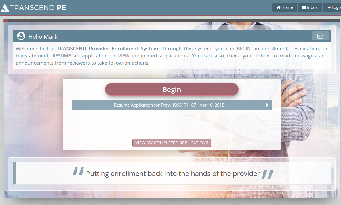
application welcome and instructions
For the Dashboard that enrollees see first upon entry to the application, I welcome them with instructions on how to proceed using the three main operations in caps to provide additional visual cues.
external link and warning
Providers must indicate whether they are required to have a compliance program by consulting an external website. I direct them to the site using an icon similar to the external link icon used in Wikipedia for familiarity. The highlighted warning at the top informs enrollees of potential financial risks if they jump ahead of the enrollment process.

multiple repeating entries
Some providers render services at multiple locations which need to be entered in the enrollment system. In order to scale the form to handle providers with different numbers of locations, the Add function allows providers to enter their additional locations and tag them with a unique identifier that they specify for ease of identification. I conveyed this in three sentences in concert with the form description and field labels.

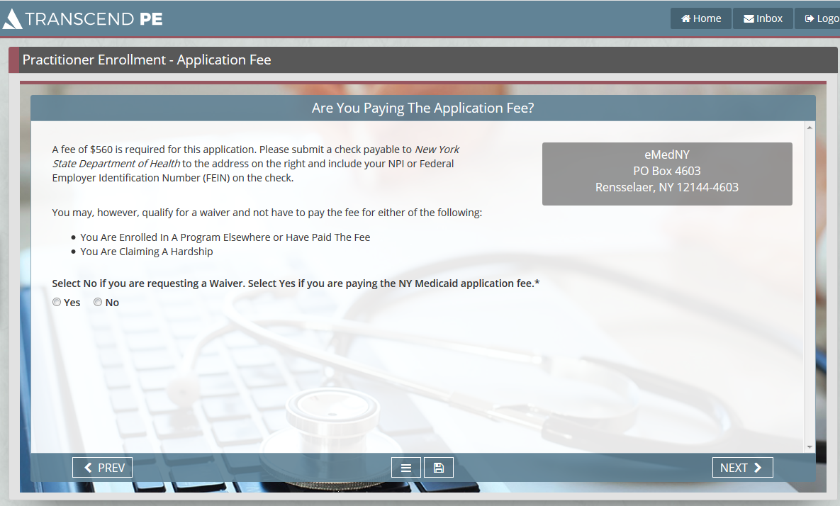
conditional options
Not all providers pay an application fee and only the ones that do see this form. They may also apply for a waiver due to certain conditions and not pay the fee. I make sure that it is clear how to make out the check and where to send it, and make equally clear the circumstances for applying for a waiver. Also, I reversed the order of instructions for Yes and No on paying the fee by having No first for additional emphasis.
uploading attachments
Providers must upload one or more documents. I tell them how to get the documents from their system to the application, and how to work with them once they are uploaded. In addition, I used a larger font offset in a bounded area to clearly list the allowable document types.
